















Two of the biggest names in operating systems and software have both released their take on the ideal to-do list app. While Google opted for a barebones, laser-focused application centered on giving individual users maximum control, Microsoft attempted to take the genre further and add some collaboration into the mix.
The execution of these parallel goals rapidly diverges upon actual use of either company's app, showing different priorities, apparent target demographics, and levels of cohesive design.
We've reviewed both Google Tasks and Microsoft To Do already, highlighting the pros and cons of each application. If you'd like to take a deeper dive into the specifics of each, take a look at our coverage linked below.
Of course, it's unlikely any single implementation of a to-do list manager will be perfect for everyone. So, with that in mind, let's decide whether Microsoft To Do or Google Tasks is the best option for most users by pitting them against each other in a head-to-head comparison of availability, cost, external service integrations, widgets, functionality, and ease of use.
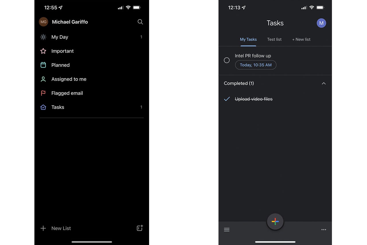
The main screens of each app (Microsoft To Do - left Google Tasks - right).
Michael GariffoBoth apps are available as free downloads: from Google Play for Android and from the Apple App Store for iOS. Each version also includes a web-based variant that ties into its company's primary email service: Gmail for Google Tasks and Outlook for Microsoft To Do. Unlike many competing solutions, there is no enhanced tier of either app available via monthly or annual subscription fees.
More: Google: Gmail is getting this new look to make switching between apps easier Microsoft marches toward its 'One Outlook' rollout
It's also worth noting that, while both apps support smartwatch notifications, neither is available via an official app for either the Apple Watch series or Google's Wear OS-based devices.
Which app wins this category of the competition depends largely on whether your day-to-day is more reliant on the Google or Microsoft ecosystems. Heavy Gmail users might want to opt for Google Tasks just for its ability to immediately create tasks from within Gmail, while Outlook aficionados might want to use To Do for the same reason. However, I wouldn't call the relatively minimal email functionality offered by these apps (covered in more detail below) vital enough to be the sole deciding factor in which one you ultimately choose.
Winner: Tie
As stated, Google chose to integrate its Gmail service into Google Tasks, while Microsoft integrated its Outlook email solution. This is the only direct external interactivity offered by Tasks that's really worth mentioning. However, Microsoft's To Do once again attempts to go a bit further by looping in the company's Planner solution to introduce collaboration tools.
More: Best collaboration apps: Top team tools
As I mentioned in my review, any usability Planner may have added to To Do for me was curtailed by the fact that I couldn't find a single soul I knew using Planner. This is a perfect example of Microsoft going a bit too far for a standard to-do app, and not quite far enough to turn To Do into something like a version of Microsoft Teams for your personal life.
As for each app's competing email functionality, they're basically identical. Both apps include a one-click method of turning an email into a task from within their respective email client interfaces. This means Gmail gains an "Add to tasks" button while Outlook gets "Create a task" as a new option within its "..." menu. Both will create a new task with the title being set to the originating email's subject line.
More: Will double-filing my Gmail email use up my space?
Neither is a life-changing feature. However, the web-based Gmail interface allowing you to immediately fill in additional fields like due dates and notes gives it the edge for me. All of To Do's variants require you to create the task from an email and then edit it later if you want to add the aforementioned details to it. This once again brings an extra, unnecessary step to what should be a simple process.
Winner: Google Tasks
Three of Microsoft's four available To Do widgets (left) and both of Google's available Tasks widgets (right).
Michael GariffoBoth apps support a selection of widgets that are largely identical across their Android and iOS deployments.
Google has two variations: a small 2x2 version that provides a truncated view of your top tasks, with one-tap access to opening the app; and a larger 4x2 list that provides quick access to individual tasks, as well as an included button for adding new tasks.
Microsoft, meanwhile, includes four widgets: a 2x2 version that lists tasks from the "My Day" screen; a 2x2 version similar to Google's smaller offering, but with support for one-tap access to new task creation; a 4x2 version that lets you see longer titles, mark individual tasks as completed, and add new tasks; and a screen-filling version that does essentially all of the same things as the previous widget, but takes up far more screen real estate.
Both companies' widgets include options that let you choose which of your task lists a widget displays, meaning you can have multiple widgets for multiple lists. However, Microsoft's slightly wider variety of widget size options, and the fact that you can add a new task from any one of them, regardless of their size, gives it the edge here.
Winner: Microsoft To Do
As I mentioned in the intro, Google Tasks and Microsoft To Do take very different approaches to introducing their functionality to new users. Microsoft chose to immediately present new users with a long series of automatically curated lists, while Google Tasks says hello to newbies with an almost completely blank slate.
This initial comparison informs just about every aspect of the user experience for both apps. At every turn, Google Tasks provides a minimalistic framework to give users just enough functionality to manage their tasks. Meanwhile, Microsoft attempts to go above and beyond what the average user might need. While Google's lack of complexity might mean its options fall short for some advanced users, Microsoft's attempt to exceed expectations backfires as often as not.
More: Best task management software
During my time testing both apps, I continually felt like Tasks gave me the freedom to create a surprisingly comprehensive set of reminders and lists across my personal and work calendars. While Microsoft To Do provided the same functionality for me, I was constantly bumping up against features I had no use for and working through interface elements that just slowed me down.
Winner: Google Tasks
The initial menu you're presented with when attempting to set a date and time in Microsoft To Do (left) and Google Tasks (right).
Michael GariffoI've nibbled around the edges of this category above. But it deserves its own section due to the basic purpose of to-do list apps. We seek out organization to make our lives easier, reduce the amount of time it takes to complete unpleasant tasks and errands, and to increase the amount of free time we have by enhancing our day-to-day efficiency.
This is why it's of paramount importance that the app we choose to organize our busy schedules is, itself, not a drain on our time.
More: Work from home? Things I wish someone had told me before I started
I won't be hyperbolic here and act like Microsoft To Do has a massive learning curve, nor will I claim most actions in it take more than a few extra seconds to complete when compared to the same action in Google Tasks. But, those few extra seconds add up, especially if you create numerous tasks per day. Setting up a new task should be as easy as it possibly can be. This ensures that we, as very human and often very lazy individuals, actually continue using these apps with a frequency that will have a real, beneficial impact on our daily lives.
Our recommended models for every use case and platform.
Read nowIf adding a task is consistently a breeze, we'll do it any time there's any chance of it being useful. Conversely, if it's a hassle that takes more than 10 seconds or so to complete, we're far more likely to just let it go and try to remember on our own. I think we all know how dangerous that can be.
More: We spent nearly 5 hours a day on our mobile devices in 2021
Google Tasks does precisely enough to make it a quick, easy, flexible solution for keeping track of what you've got to get done in a given day. Although Microsoft To Do can fulfill almost all of the same goals, it takes just enough longer to make me want to use it less.
Winner: Google Tasks
Since both of these applications are free, I'd still suggest giving both a shot to see which one works best for you. That said, I'd definitely start with Google Tasks. It is the solution I'd choose and the one I'm continuing to use as I write this comparison. Its simple design, never-overwhelming interface, and basic but handy Gmail integration make it an ideal fit for me. I think many readers out there will find it suits all of their needs, without ever getting in your way by making you page through options you'll never use or wrangle pre-made lists you didn't ask for.
Of course, preferences differ. That's why it's great that there's no downside to giving Microsoft To Do a crack as well. If you feel like you're bumping up against any limitations in Tasks, To Do might be the solution for you. Or, if you're part of a family or business that's actively using Planner, its collaborative features might actually work for you.
Neither offering will be perfect for everyone, but Google Tasks is the most likely of the two to satisfy the largest group of potential users across the widest number of use cases. For this reason, I'd recommend it as the best starting point, even if you might feel like you've outgrown it down the road.
Winner: Google Tasks
 Etiquetas calientes:
tecnología
Servicios y Software