







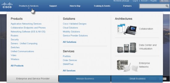
Did you notice the recent change to the menus on Cisco.com? We call them "megamenus" - those convenient lists that fly down when you mouse over the masthead bar on any page on Cisco.com. We recently updated the "Products & Services" megamenu on the site to make it more readable and simplify navigation.
Here's the new improved Products megamenu:
For comparison, the here's previous version:
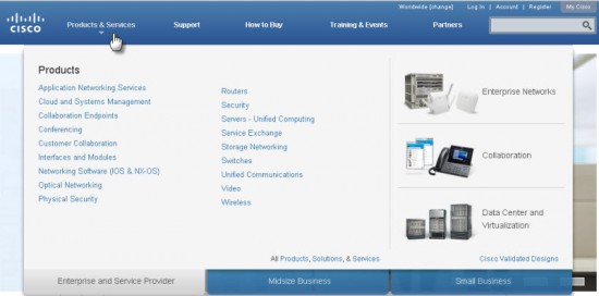
What We Did
Do you notice what's changed?
We think this is a nice simplification for our site-wide mega menus. And, of course, you can still find the full list of all products via the "All Products" list.
Enjoy!
(And, as always, if you have feedback, please send us a note here or at the [+]Feedback link that's at the bottom of every page.)
 Etiquetas calientes:
digital experience
productos
usability
navigation