












Over the past several days, I've been exploring what might just be one of the most meaningful Android advancements in recent memory.
It's a shiny new feature that's poised to change the very way we interact with our devices. It's also one of those things you really have to experience to fully grasp - because it's essentially taking anexistingfunction and reframing how we use it. But subtle of a shift as that may be, it isincrediblysignificant in terms of real-world value.
The feature, while technically brand new and in the midst of rolling out to a very small subset of Android devices right now, is also quite familiar. In fact, if you've been paying attention to Android for long, you'll almost certainly make the connection between it and an eerily similar system from nearly a decade ago.
The feature is Google's Circle to Search system, which is currently available on the new Galaxy S24 phones as well as Google's own Pixel 8 and Pixel 8 Pro devices. After having lived with it and used it regularly for about a week on my personal Pixel 8 Pro, I genuinely do think it's brilliant and a much more important innovation than most people realize.
And that's in spite of the fact that it's an almost near-exact replica of a once-high-profile offering from our collective Android past.
[Love Android? Get fresh Googley insight and experience-enhancing pointers in your inbox with myAndroid Intelligence newsletter. Three new things to know and try every Friday!]
Let's back up a little to set the scene here - 'cause this context really is critical. Way back in the prehistoric era of 2012, y'see, Google came out with a concept known as Google Now.
It was part of the now-ancient-seeming Android 4.1 (known at the time as "Jelly Bean") Android version, and it was all about making contextual info available to you proactively, before you even realized you needed it.
It was "Android's new secret weapon," as I wrote at the time:
We're finally reaching the point where technology is becoming about the user - not the device. Your searches, schedules, and needs follow you seamlessly from PC to phone to tablet, and you don't have to think about any of it. That kind of streamlined simplicity never gets old: Even after a month, every time I walk out to my car and see Google Now info waiting on my phone - info that came up on its own based on my habits or something I did at my desk - I can't help but smile.
It truly felt like the future - a natural progression in putting our devices one step ahead of us and making them seem like extensions of ourselves instead of just isolated islands, as some exceptionally handsome young dorkus once put it.
And, particularly pertinent to our current discussion, it paved the way foranotherfuturistic feature just a few years later - a little somethin' called Google Now on Tap, which took that same concept and integratedit evenmoreseamlessly into the Android experience. With Now on Tap, you could simply press and hold your phone's Home button (as this was in 2015, long before the advent of Android gestures) to have Google examine everything on your screen and offer up interesting ways to interact with it.
Go, go, gadget time-machine:
In essence, Google Now on Tap takes the power of Google Now and makes it a core part of the Android operating system. Instead of just being a standalone app that you open sometimes - and maybe see in your notifications once in a while - Now on Tap turns Google Now into a connective tissue that ties everything on your device together with potent Google intelligence.
As for the specific sorts of feats Now on Tap could accomplish - well:
Tapping and holding the Home key tells Google Now to use the context on your screen to give you more information about whatever you're seeing. That allows you to get extra knowledge about something without having to stop what you're doing, go to Google or your Web browser, and manually search for what you want.
Real-world examples are really the best way to understand it. Say, for instance, you're looking at a text message from a friend suggesting a particular restaurant for lunch. You could tap and hold your Home key, and Now on Tap would instantly bring up a card showing you info about the restaurant your buddy mentioned - ratings and reviews, a quick link for directions, and links to get even more info by jumping over to a relevant app like Yelp or OpenTable. ...
The system can also use contextual info on your screen to answer a question. If you're listening to a song, for example, you could simply say: "Okay, Google, who's the lead singer?"- and Now on Tap would pop up a card with the answer. Or if you're looking at a place in Yelp, you could say: "Okay, Google, how far is it from here?" and Now on Tap would figure out what you mean and show you a map with the info.
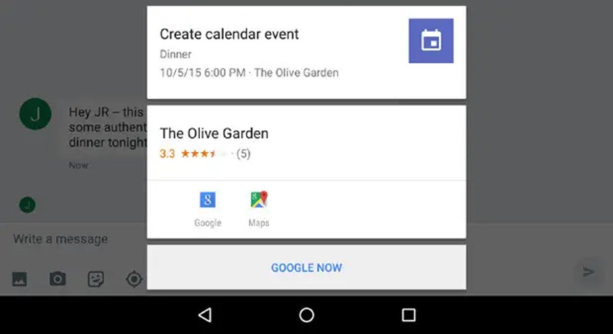 JR
JR Google Now on Tap, as seen and captured by the author in 2015.
It was arevelation - not to mention a delightful full-circle realization of Android's unique strengths. But then, Google did its Typical Google Thing? and killed the whole thing off with no fanfare a year or so later, before it ever had a chance to flourish.
We're revisiting all this history right now for a reason. If you somehow haven't yet picked up on it, this is from top to bottom almostexactlythe same thing Circle to Search is now doing - at least, conceptually speaking.
And it's no less impressive or transformative today than it was a decade ago. In fact, it's evenmoreuseful now, because the technology beneath it has progressed considerably since this concept first came into our lives way back in 2015.
At this point, I actually don't have to tell you too much about Circle to Search - because it really is the same as what Now on Tap did all those years ago, only with even more oomph beneath its surface.
With Circle to Search, you press and hold your finger to the bottom-center area of your screen - the same exact spot Now on Tap used, despite the fact that there's no longer a button there in the contemporary Android gesture arrangement. (See?!)
That then summons a special visual overlay in which you can use your finger to circle, highlight, or select any visible element on your screen - some text, an image, even textwithinan image. And then, in a split second, Google will analyze that element and give you results related to it.
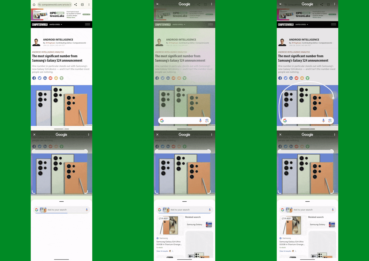 Google/JR Raphael
 Google's Circle to Search system in action on Android - like having Google, now. On tap.
You can even ask follow-up questions related to your selection to seek out more specific information, if you're ever so inspired. Feeling familiar yet?
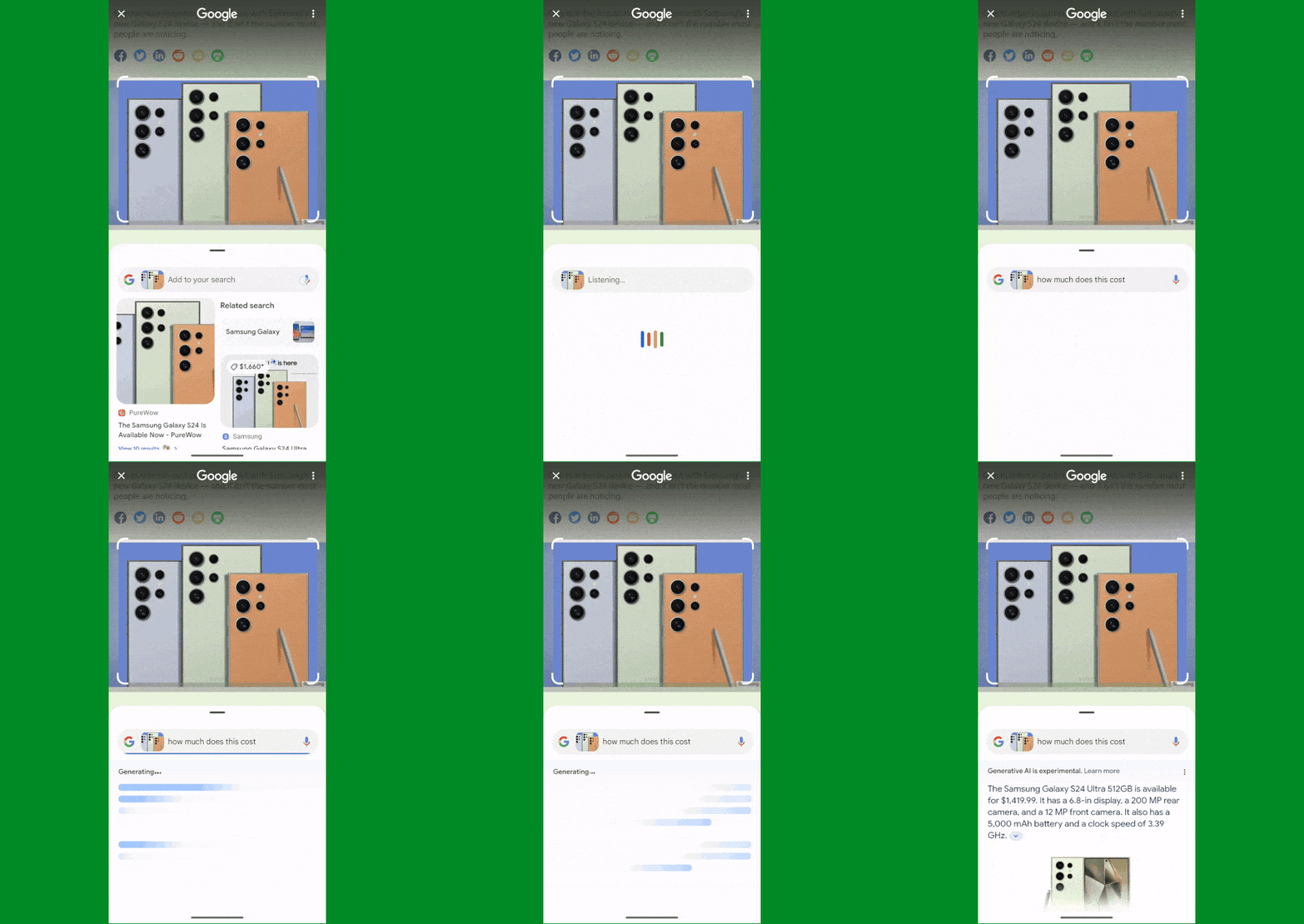 Google/JR Raphael
 You can ask follow-up questions related to anything spotted in Google's Circle to Search setup.
The underlying intelligence here comes mostly from the Google Lens Android app, which is able to perform all sorts of impressive context-creating feats around text and images alike. Because of that, it's entirely possible to emulate this same system simply by snapping a screenshot and then sharing it directly with Lens, as we went over the other week.
But I've come to realize that while that's a fine workaround and way to accomplish the same end result for anyonenotusing a Galaxy S24 or Pixel 8 model at the moment, it fails to capture the full magic that Circle to Search introduces into the Android environment - because that magic is in large part about how impossiblyeasyit is to access the associated info and how seamlesslyintegrated into Android it becomes.
It's the same effect you can get from my workarounds, in other words, but a very different experience. Having that capability to interact with any manner of info immediately and right there, as a core part of the Android interface and without any real disruption to what you're doing, is what makes Circle to Search so effective and compelling. That simplicity and convenience go a long way in shaping what the system's like to use and how often you're likely to use it, and that's something I didn't fully grasp until I'd lived with Circle to Search for a while.
So, yeah: Just like Now on Tap before it, what makes Circle to Search so impressive is not only what it can do but how naturally it brings that power into Android and makes it a core part of the user experience.
Now, that being said, Circle to Search in its current form isn't perfect. While the technology at its core has come a long way since the time of Now on Tap and gained plenty of pertinent new powers, the method for activating the system no longer makes sense in the context of a gesture-centric platform. Plain and simple, pressing and holding your finger onto a tiny little line is awkward. It's all too easy to miss the target entirely, and without any realbuttonin that area with an Android gesture arrangement, it also doesn'tseem at all obvious or intuitive that pressing and holding your finger there would even do anything in the first place.
Hopefully, Google can refine this and evolve to a more sensible and natural-seeming gesture of some sort eventually - something like the rarely remembered swipe-up-diagonally-from-a-corner gesture already available for Assistant on the company's own Pixel products. Combine that with occasional visual cues to remind everyone that the gesture is there and available, and you've got a far more effective place for this system to exist.
Circle to Search as a name also isn't exactly memorable or something that slides off the tongue. In my go-to exercise of "imagining how we'd be hearing about this ifApplehad come up with something similar," it's abundantly clear that Google's doing that Typical Google Thing? again and offering up an incredible concept that most people will never even know about - whereas Apple would give the system amagical-seeming name and market the hell out of it to make sure everyone in the universe was aware.
A little touch of that flamboyance would go a long way and allow Google to make this matter - and make everyday Android device-owners as well asprospectiveAndroid device-buyers realize what a powerful advantage it could be putting at their fingertips.
Once you set the hilarity of Google's 360-degree flip-floppery aside for a second, the fact that Circle to Search is bringing a classic, once-promising, and abandoned-all-too-soon concept back to the forefront is actually a phenomenal thing. We may have lost nine years of use and active development, but at least we're getting back on track now. And Circle to Search is quite clearly picking up right where Now on Tap left off.
All we can hope is that the similarities between these two endeavors end there - and that this time, Googledoesn't lose its focus and decide to move onto something else before this system gets its chance to shine.
Want even more Googley knowledge?Sign up for my free Android Intelligence newsletterto get next-level tips and insight delivered directly to your inbox.
 Etiquetas calientes:
Inteligencia Artificial
Sistemas operativos
Google Google Google Google Google Google Google Google Google Google Google Google Google Google
Android